Redesigning Consultant Platform
Revamped an edtech SaaS platform, simplifying the user journey for students and consultants while boosting credibility and engagement.
SaaS
UX
UI
Visual Design

Project Overview
Over two months, I led the end-to-end redesign of Experiment Labs, an edtech SaaS platform that empowers study-abroad education consultants to manage student engagement and deliver profile-building services.
My Contributions
As the sole UI/UX designer, I owned the project from discovery to launch. My responsibilities included:
Conducting user research with students and consultants.
Synthesizing insights into clear pain points.
Streamlining the information architecture.
Designing, prototyping, and iterating in Figma.
Ensuring the new design aligned with both user needs and business goals.

The Problem
Visitors couldn’t easily understand what Experiment Labs does, leading to confusion and missed conversions.
Although Experiment Labs received steady web traffic, its conversion rate was just 2.1%. User testing revealed the core issue: visitors were unable to distinguish the platform’s value, credibility, and differentiation from other offerings.
Company Insights
Through interviews with the founder and stakeholders, I learned that Experiment Labs was simultaneously targeting two audiences:
Education Consultants (Primary Users) – They use the platform to manage students’ journeys, track progress, and offer guidance.
Students (Secondary Users) – They access the platform (via consultants) to explore career-building programs and mentorship opportunities.
This duality wasn’t clearly communicated in the old website, leading to confused messaging.
User Research
To understand user perspectives, I conducted interviews with:
Students (ages 14–18) pursuing international education.
Parents, who often act as financial decision-makers.
Key Findings:
Lack of Clarity → Students and parents didn’t understand Experiment Labs’ offerings at first glance.
Poor Differentiation → The website didn’t highlight how the platform was different from competitors.
Trust Gaps → Families felt counseling was a risky investment without proof of success.
Decision Paralysis → Overloaded navigation and scattered content made it hard to take the next step.
“We’re already spending thousands on applications. I need to be convinced this will actually make a difference.” – Parent interviewee
Ideation & Design Decisions
I reframed the pain points into design opportunities:
Pain Point | Opportunity | Design Solution |
|---|---|---|
Weak credibility | Emphasize success | Highlight student success stories, mentor credibility, and partner logos |
Added impact metrics | ||
Poor differentiation | Unique storytelling | Structured sections showing how Experiment Labs is different |
Unclear journey (students vs consultants) | Personalized navigation | Audience selection modal at entry point → “I’m a Student / I’m a Counselor” |
Distracting CTAs | Clear conversion pathways | Strategically placed CTAs across pages |
Key Information Architecture Updates
Audience Customization at Onboarding → Added a welcome modal where visitors self-identify as a Student or Counselor. This personalizes the flow right from the start, removes ambiguity, and ensures relevant content is prioritized.
Simplified Navigation Bar → Dropdowns grouped by audience & content.
Partnership Pathway → Dedicated pages showing consultants how collaboration works.
CTA Placement → Repeated but non-intrusive, ensuring visibility without overwhelming.
Program Showcases → Filterable cards (Innovation / Business / Creative) for quick exploration.
Design Solution
Experiment Labs’ new website positions the platform as a trusted partner in the study-abroad journey by:
✦ Clarifying the value proposition in the hero section.
✦ Offering personalized pathways (students vs consultants).
✦ Showcasing mentors, success stories, and student brands.
✦ Streamlining navigation for fewer clicks and less confusion.
✦ Creating a visually cohesive, modern brand identity.
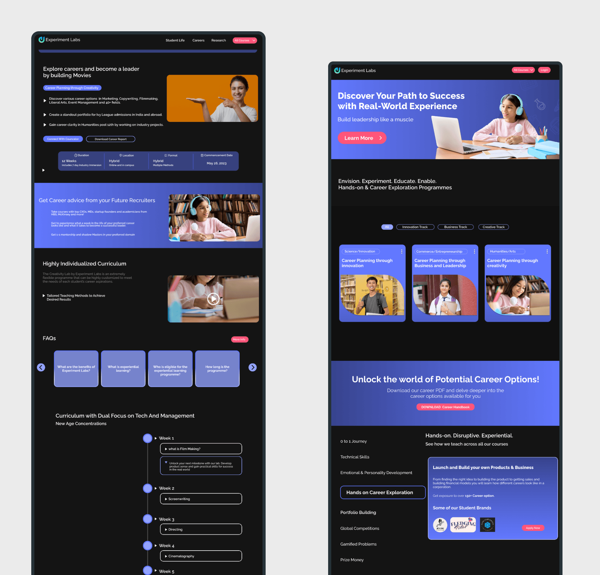
Before the Glow-Up
The website in its original state.
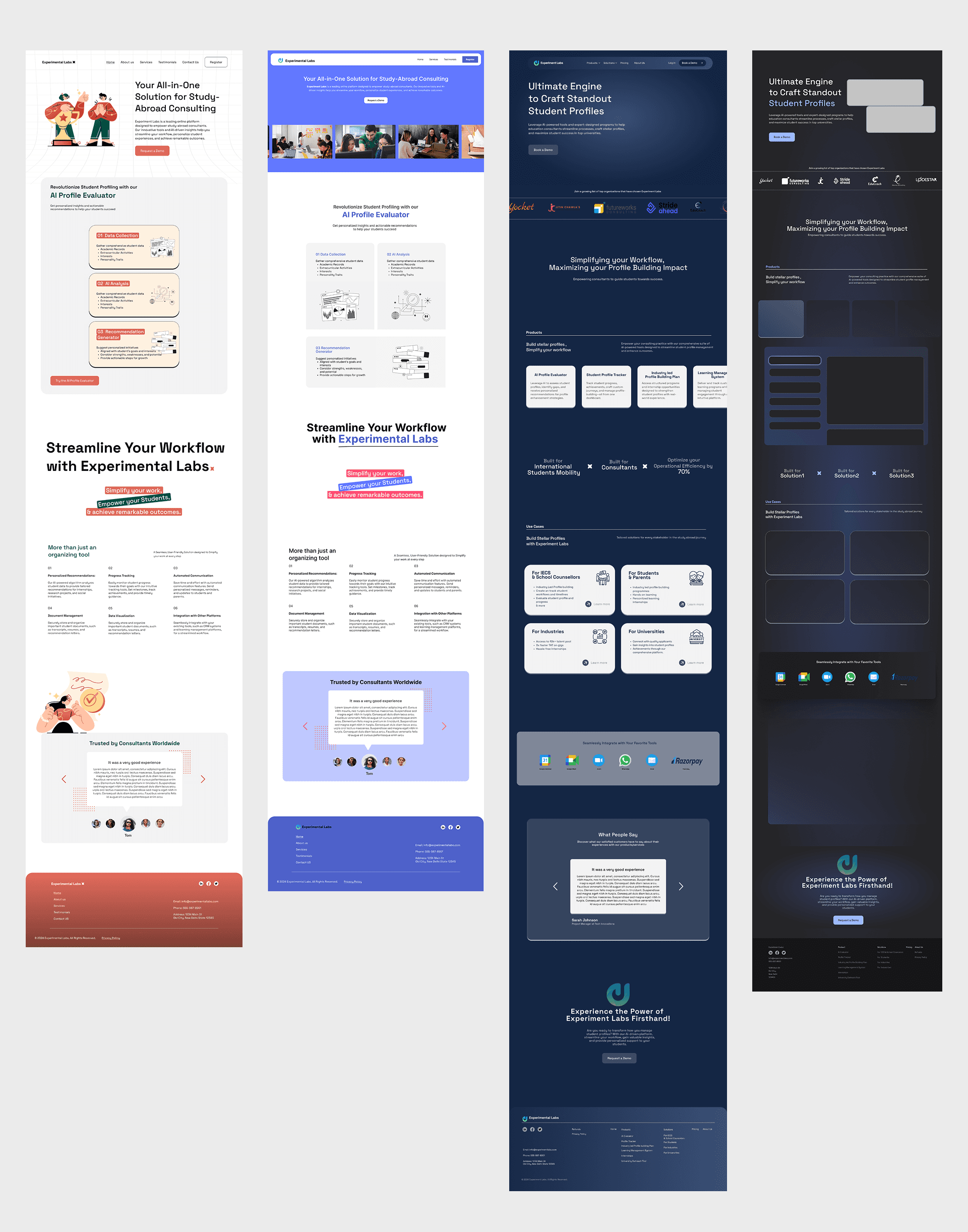
The Awkward Phase
Exploring multiple directions and refining ideas with the team.
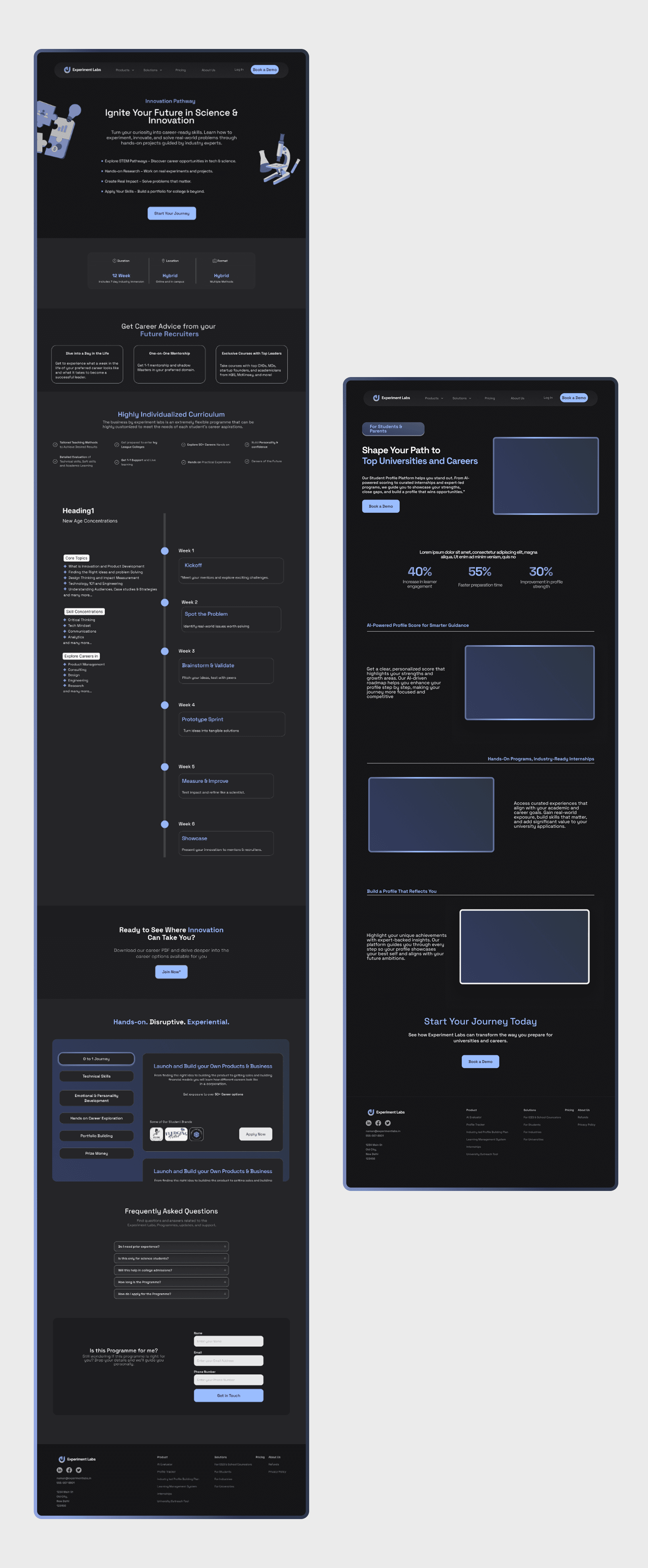
✨ The Glow-Up
The final design with a clear, polished identity.
Landing Page

Product & Solution Page
Impact & Takeaways
✦ Clarity: Users now immediately grasp Experiment Labs’ role and audience.
✦ Conversion: Early analytics showed improved engagement (downloads/sign-ups).
✦ Trust: Mentors, testimonials, and partner showcases increased credibility.
✦ Personal Learning: I realized the importance of balancing dual-user messaging while avoiding cognitive overload.
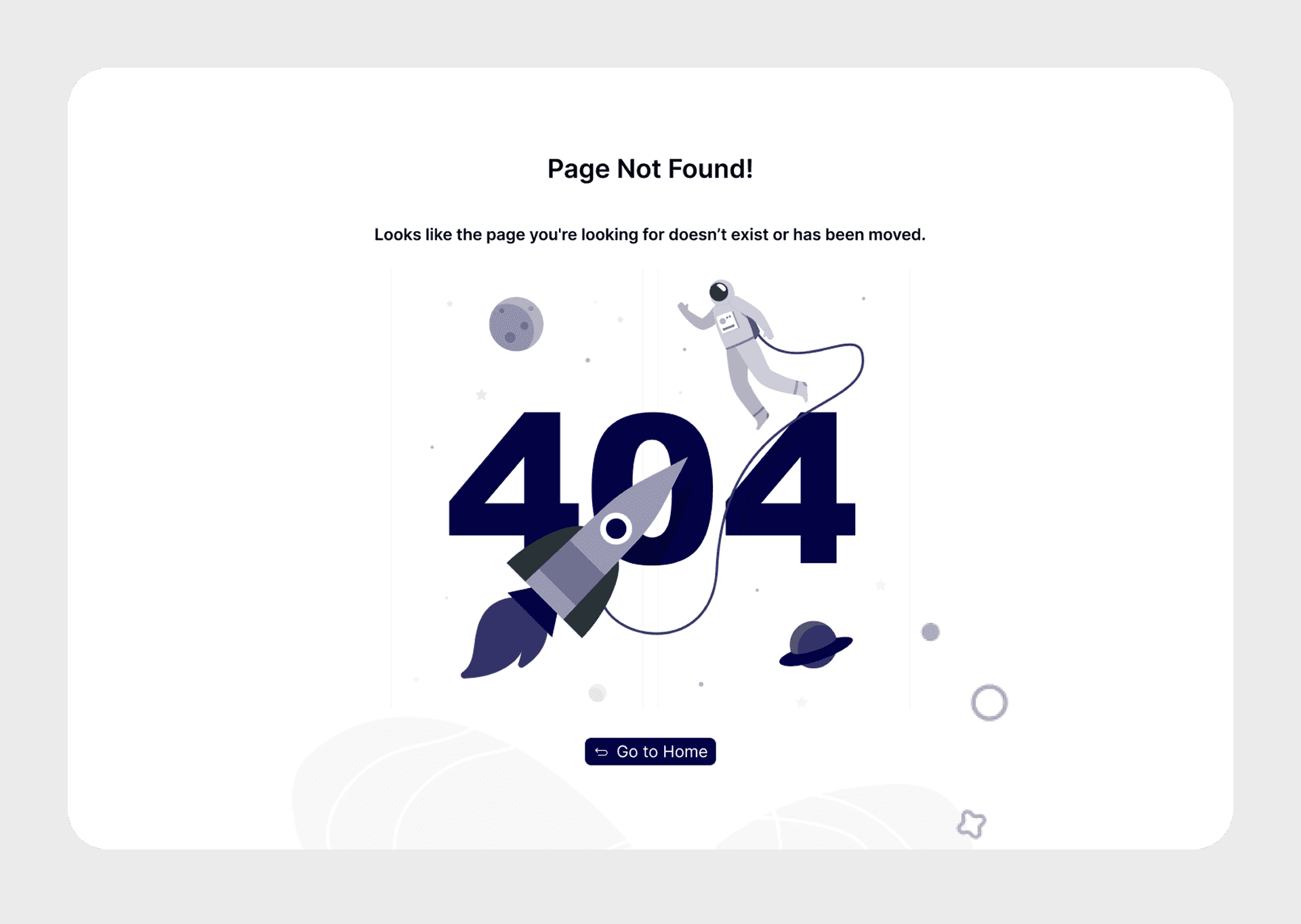
404 Page.