AI-Assisted Profile Builder for Study Abroad Students
Designing an intelligent guidance system that helps students understand where they stand, what to do next, and why? while giving consultants the clarity to scale their work.
Product Design
SaaS
UX
UI
Multi-user System


I was the sole UI/UX designer on this project — responsible for end-to-end design across both consultant and student interfaces, from onboarding flows to the AI recommendation system.
Note: Product details have been generalized and modified to maintain confidentiality while preserving the overall design approach.
The Problem
Education consultants manage dozens — sometimes hundreds — of students preparing for international university applications. The process was fragmented across spreadsheets, WhatsApp, and email. But the real problem ran deeper than disorganization.
Through requirements sessions with our product manager and stakeholder input, three core pain points emerged:
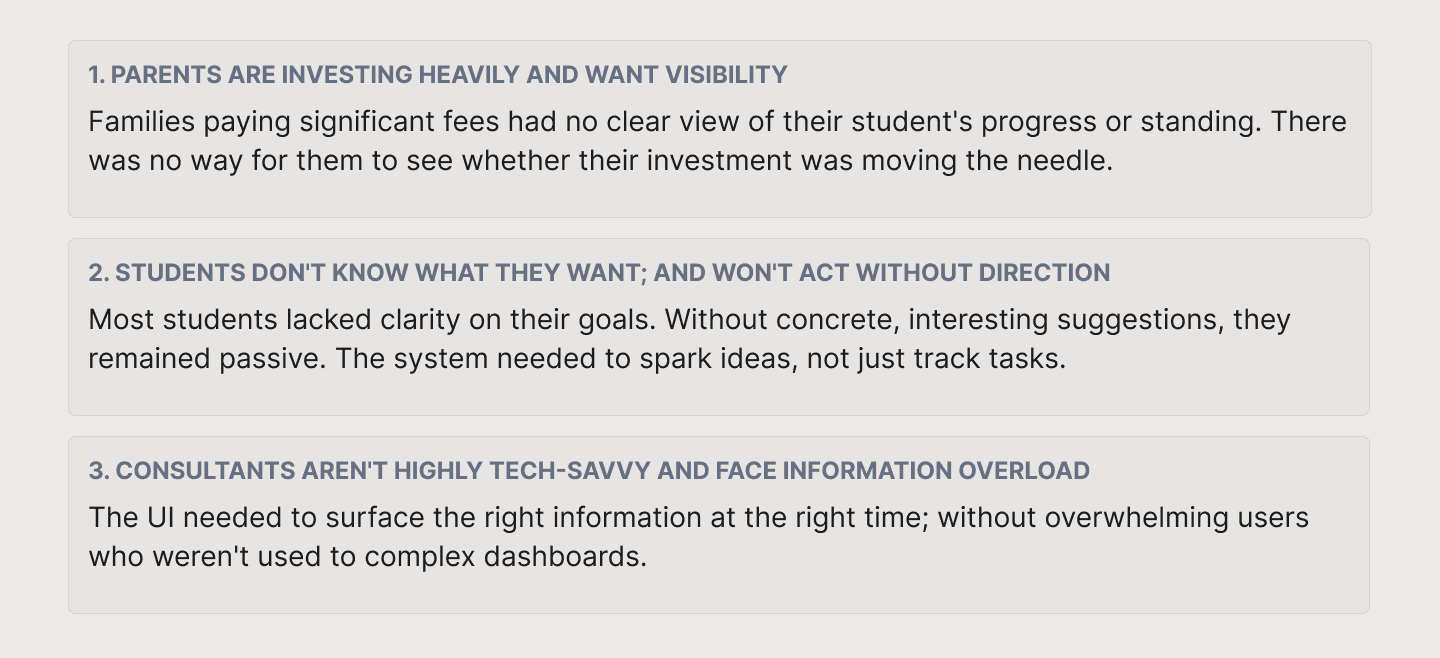
The insight that shaped everything: students don't just need management — they need direction. We reframed the product from a CRM into an AI-assisted guidance system.
My Design Process
Working within tight delivery timelines, I translated stakeholder briefs and business requirements into user experiences; always advocating for the user's perspective alongside the PM's business focus.
From brief to design decisions
While I wasn't in stakeholder meetings directly, I worked closely with the PM to understand requirements and translate them into design decisions. My contribution was consistently asking: how does this feel from the user's side? Many key design choices came from that lens; not just what the business needed, but what would actually work for a consultant managing 50 students or a student staring at a blank profile.
AI-assisted design workflow
Throughout the project, I used ChatGPT and Claude to accelerate ideation — defining pain points, exploring design directions, and stress-testing the problem framing. I used Stitch and UI inspiration sites to explore layouts and visual patterns before committing to directions in Figma. This let me move faster on a demanding delivery schedule without sacrificing quality.
The Experience
Bringing a Student into the System — the intake form
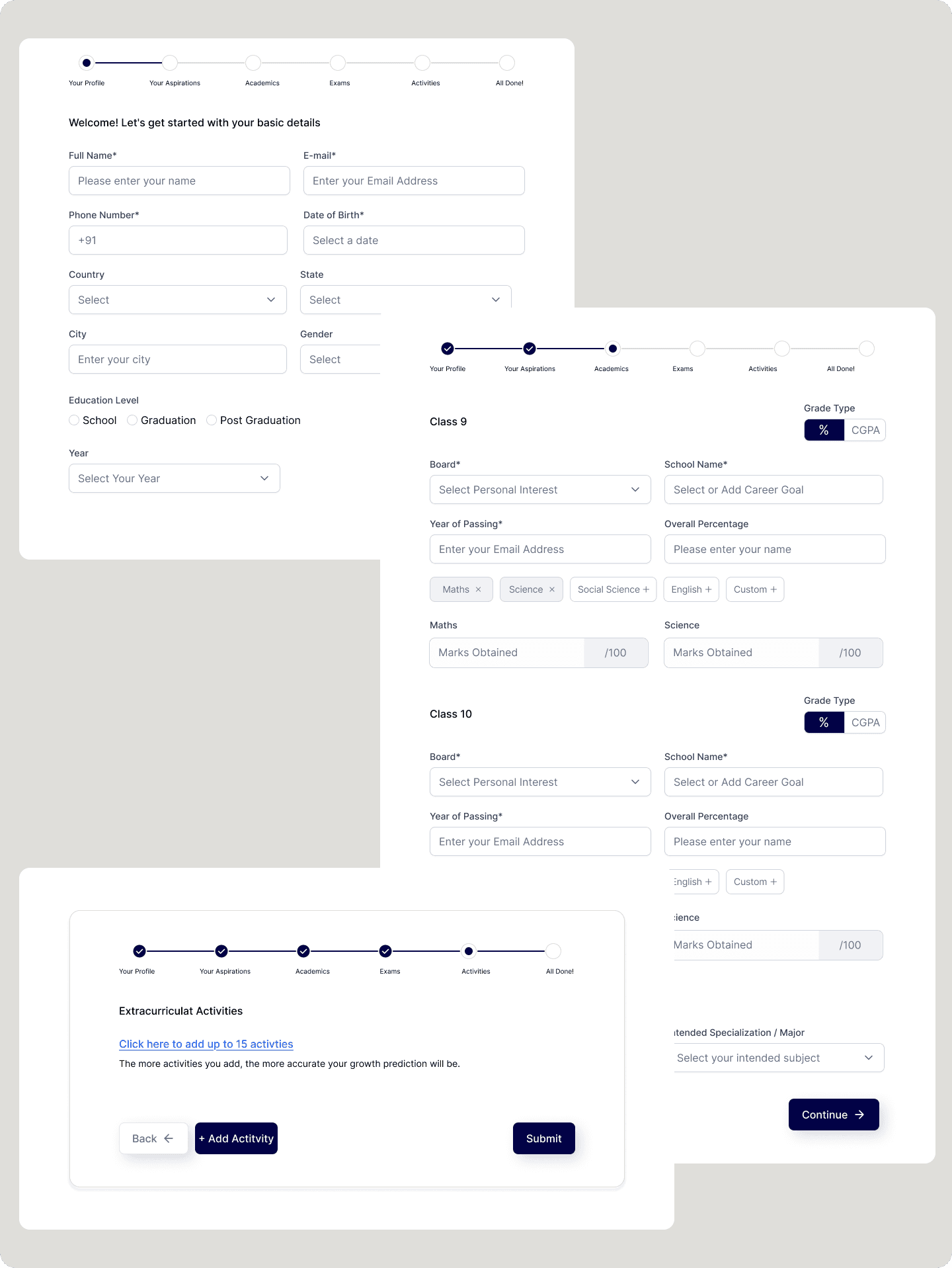
The first challenge was collecting a large amount of information without overwhelming students. Early testing revealed the original single-page form felt tedious — students disengaged before finishing, which meant incomplete profiles and weaker recommendations downstream.
The solution was a multi-step progressive form broken into named stages:
Your Profile → Your Aspirations → Academics → Exams → Activities.
Each step has a single focus, a visible progress indicator, and clear labels; so students always know where they are and what's left.
The system moves from data collection to meaningful interpretation.
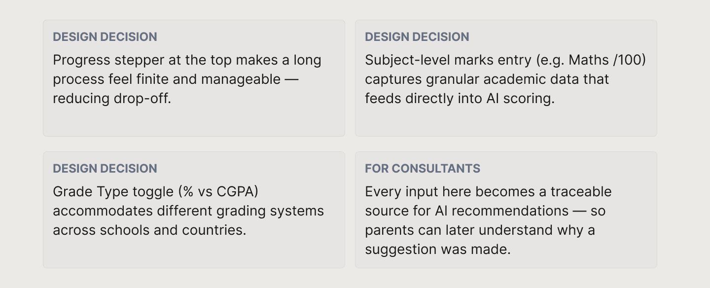
The consultant's view — student profile
Once a student is onboarded, consultants land on a centralized profile view. This allows consultants to quickly understand: Academic background, Extracurriculars, Goals and preferences. No switching between tools, no hunting through spreadsheets.
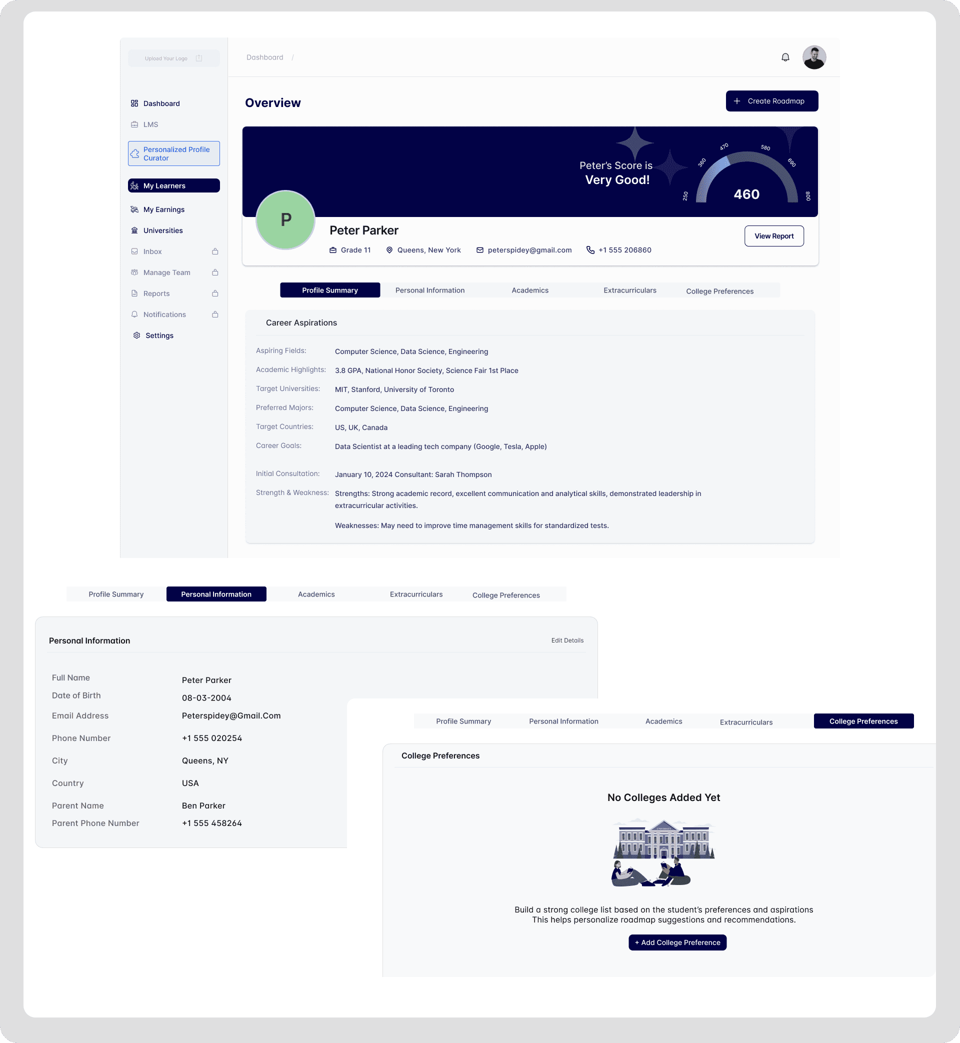
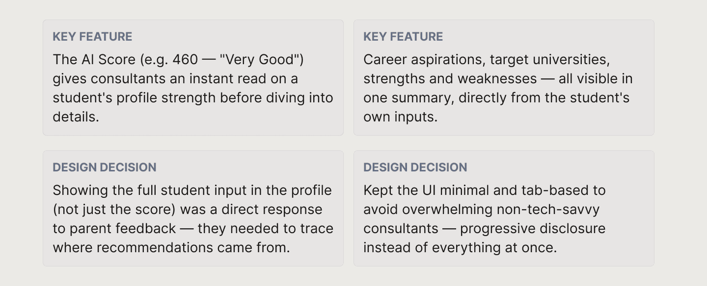
The "+ Create Roadmap" CTA is always visible in the top right. Once a consultant understands the student, the next action is always one click away.
3. From Guesswork to Intelligent Recommendations
This is the heart of the product, and the most complex design challenge. Consultants previously relied on manual judgment to recommend activities for students. This was inconsistent and didn't scale across dozens of students.
The Personalized Profile Building tab surfaces AI-generated activity recommendations, each categorized by skill area (e.g. Leadership & Initiative, Awards & Recognition) and scored by the points they'd add to the student's profile.
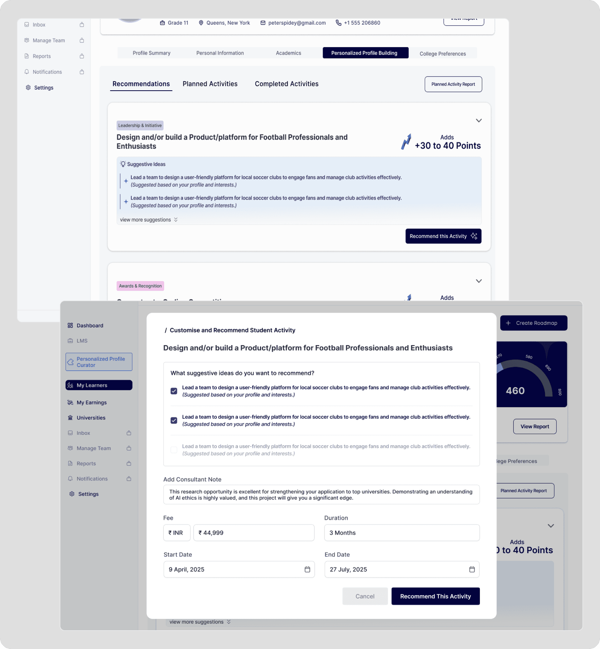
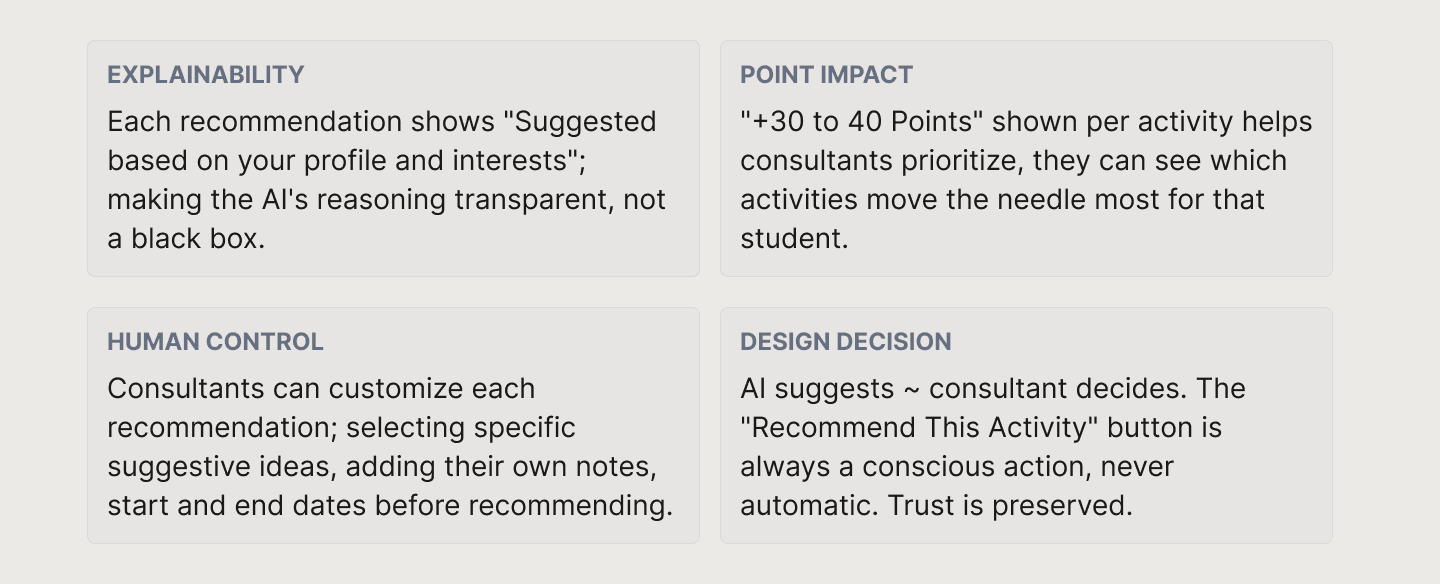
The customize modal was a key design decision: it lets consultants add their professional judgment on top of the AI suggestion — notes, context, pricing — before anything reaches the student. The AI accelerates; the consultant validates.
4. Turning recommendations into an Adaptive Roadmap
Once a consultant has finalized recommendations, they're published as a structured, time-bound roadmap. The roadmap is the backbone of the student's journey — breaking everything into milestones with clear status, progress, and timelines.

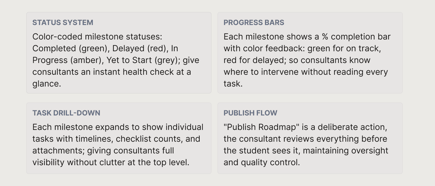
Milestone view vs Task view toggle lets consultants switch between a high-level overview and granular task management — two different mental models served by the same screen without extra navigation.
5. The student's world — keeping them on track
The student dashboard is designed for a very different user — someone less motivated, less tech-savvy, and easily overwhelmed. The design challenge here was: how do you make a complex multi-month journey feel approachable and motivating day-to-day?
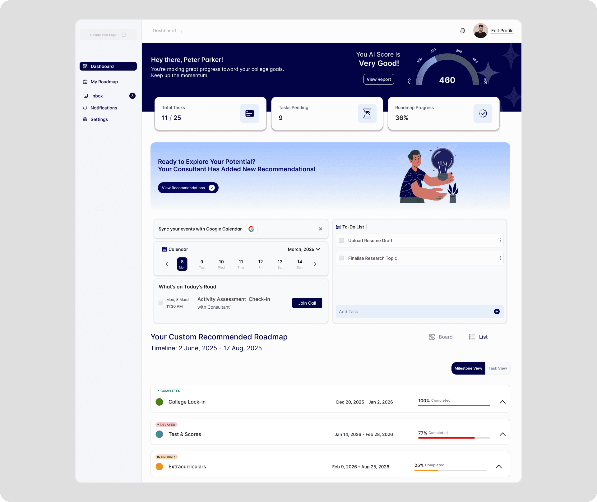
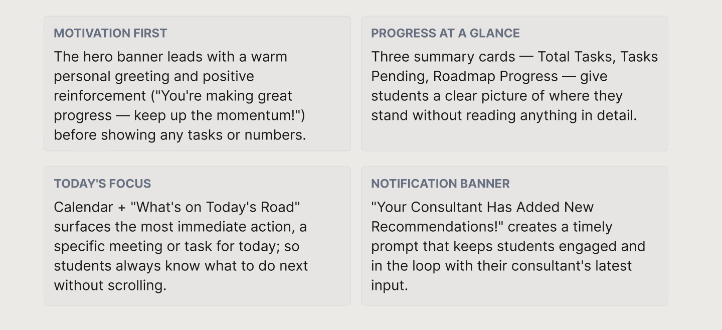
The AI Score ("Very Good — 460") is prominently displayed on the student dashboard too. This was intentional: students need to feel the impact of their progress, not just track tasks. The score makes abstract effort feel concrete and rewarding.
Key Design Decisions
Making AI recommendations explainable
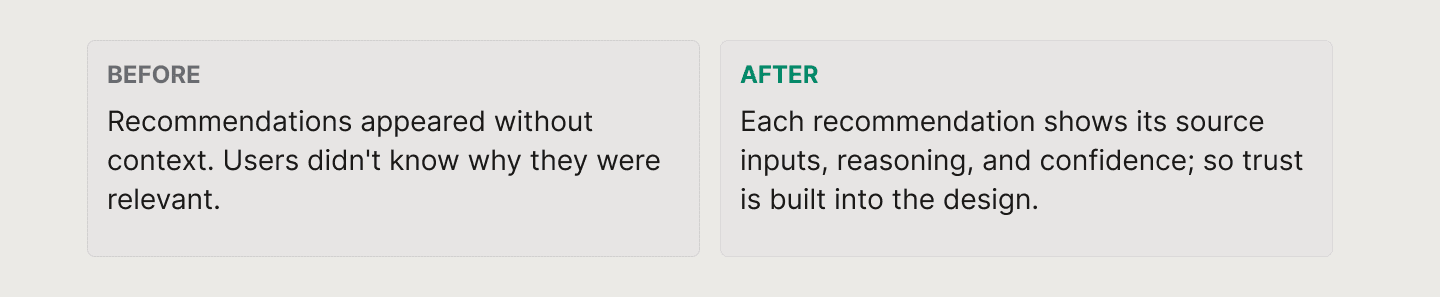
During testing with parents, a critical issue surfaced: they couldn't understand where the AI recommendations were coming from. They'd forgotten what their student had filled in the intake form — so the suggestions felt disconnected and hard to trust.
We solved this by linking every recommendation back to the student's specific inputs, and by making the full intake form visible in the student profile view. Parents could now trace the logic: "He answered X in the form, which is why the system suggested Y."
Designing for information clarity over information density
Because consultants weren't highly tech-savvy, I consistently pushed back on feature requests that would add complexity without clarity. The goal was to surface the most important information first — not everything at once. Progressive disclosure and clear visual hierarchy were the tools I relied on most.
Keeping the human in control
The AI layer was designed to assist, not automate. Consultants could review, adjust, and override any recommendation. The system enhanced their judgment — it didn't replace it. This was especially important for building trust with a user base skeptical of automation.
Iterations
Redesigning the student intake flow
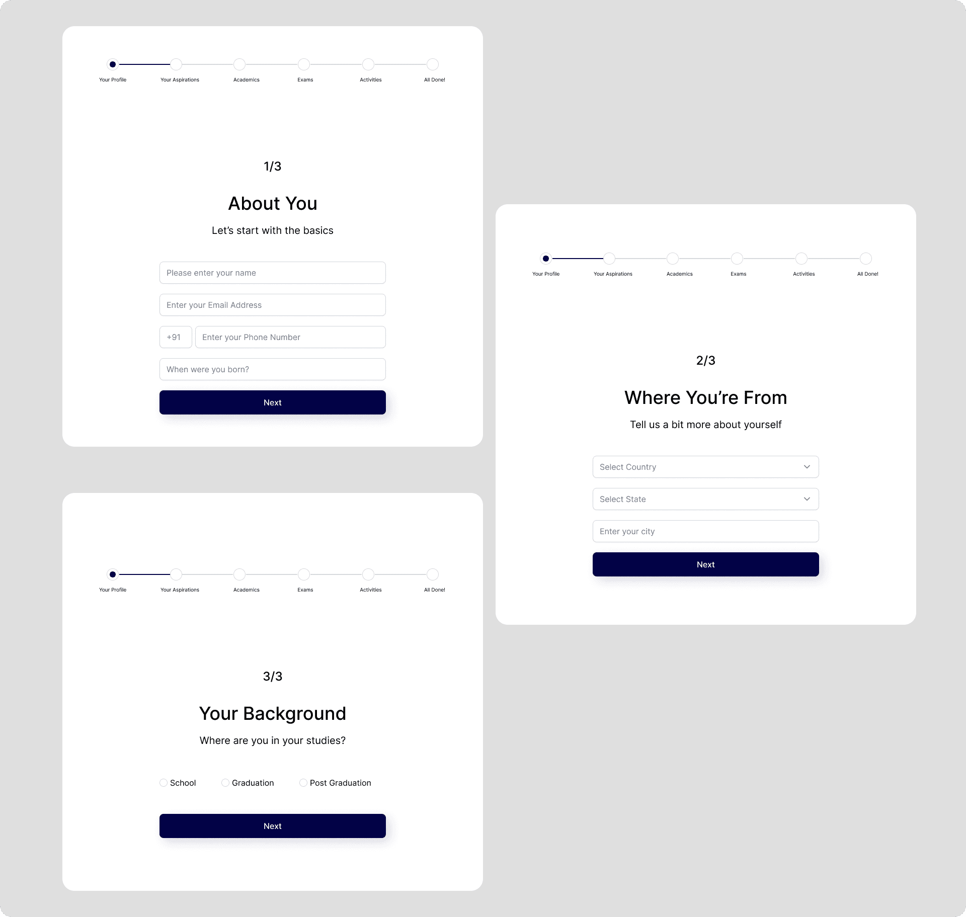
During early testing, students found the onboarding form overwhelming: it asked for too much information in a single flow. The reaction was clear: this felt tedious, and students were already a group prone to disengagement.
I redesigned the intake into segmented, progressive steps with more interactive inputs. The result was a noticeably lighter experience that reduced cognitive load and improved completion.

Additional Features
Beyond the core workflow, the platform supports consultants with several features that help manage the overall student journey.
These include:
• student management with filters and quick actions
• meeting notes and follow-ups
• reports and progress tracking
• team management for consultancy firms
• notifications and reminders
• payment flows for recommended activities
Together, these features ensure that consultants can manage everything in one place without relying on multiple tools.
Outcome
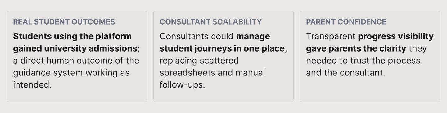
The platform was successfully delivered and went into use with real education consultants and students. Most meaningfully:
Reflection
This project taught me how to design adaptive, intelligent experiences within real constraints; tight timelines, indirect user access, and complex multi-user workflows. I learned to advocate for the user even when the brief was business-first, and to see that tension as part of the design process, not an obstacle to it.
Designing the AI layer pushed me to think about trust and transparency as first-class design concerns — not just feature requirements. If I were to revisit this project, I'd push for earlier and more direct access to end users, especially students, to validate assumptions before they became built features.